


How should packaging design be done for BlueO2 "HDO" drinking water
2023-05-24
Sichuan BlueO2 focuses on the R&D and production of HDO health drinks. The HDO drink technology and process developed based on Australian technology have been granted a national patent (patented technology number: ZL201720036644.5).
Based on AAA-grade drinking water that is rich in minerals and has a significant impact on human health, the Company has developed an "HDO" healthy drinking water product based on its profound culture and practical patented technology, combined with oxygen extraction and filling equipment developed jointly with Australia.
When the high-quality and innovative "HDO" drinking water product is developed and ready, for an enterprise that carries out R&D independently, and applies an internet+ model to marketing, a strategic package that is more suited to the high-end image and functional features of the product is particularly important!
Basic issue in packaging design – hierarchy of brand, category and product information
The package is the first stop of consumer communication, and communication is actually the transmission of information. What do you want to communicate to consumers? What information do consumers care about most? What is their first purchase motivation? What is our logic of persuasion in the limited packaging design layout?
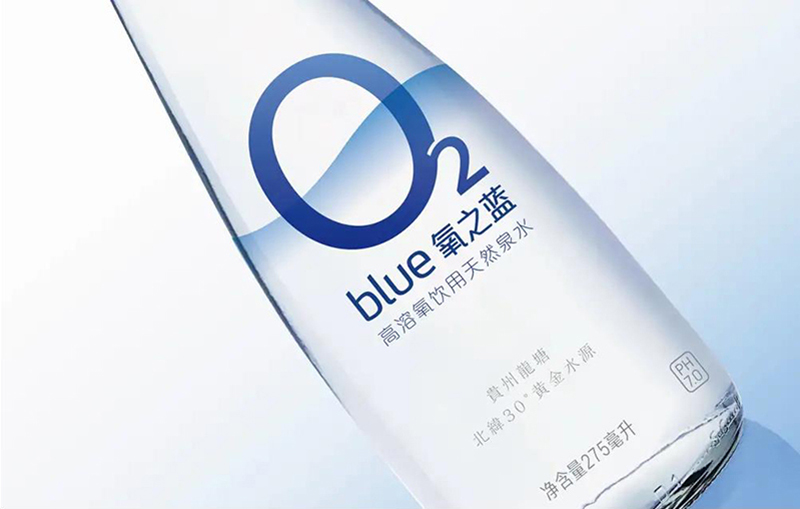
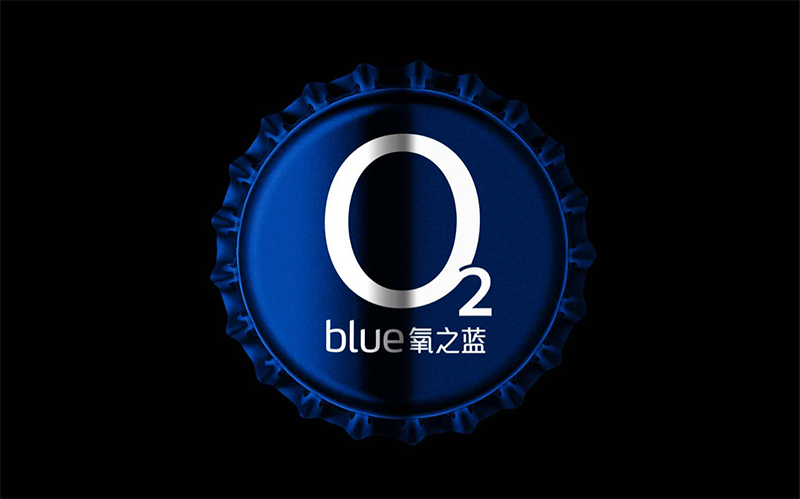
After repeated strategic analysis, consumer research and in-depth communication with Sichuan BlueO2, our focus of communication is the "HDO" product information, so we use the chemical symbol of "O2" as the visual symbol for consumer communication.
Basic principle for high-end packaging design – being simple and decent, and standing up to scrutiny
Based on the pricing of BlueO2 HDO healthy drinking water, it is undoubtedly a high-end product. Therefore, the entire packaging design must be aligned with its high-end tonality. For this healthier drinking water product, purity and simplicity must be communicated to and perceived by consumers.
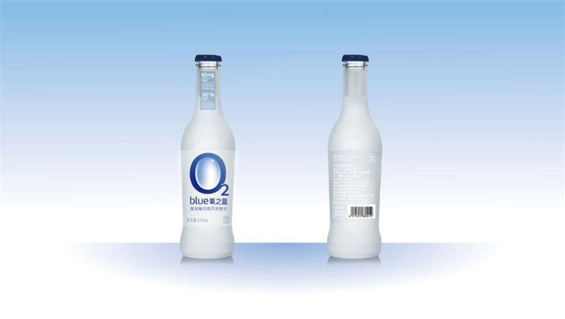
Therefore, our design team suggests using a more textured frosted glass material for the entire bottle in clearer blue and gradient colors, so that consumers can develop a perception of health, purity and functionality quickly.
Source: Shanghai Haohead Advertising Co., Ltd.
